In Japan, festivals cluster in September. As harvest season nears and communities reaffirm their bonds, streets transform into a landscape of letters: lantern names, towering nobori banners, bold characters on the backs of happi jackets, wooden placards on floats, and shrine goshuin seals. For one month, towns become open-air galleries of “living calligraphy.” This column explains why September is festival-heavy, highlights representative events, and shows how to read the deep ties between festivals and the art of writing.
1) Why so many festivals in September?
- Gratitude for the harvest: Autumn rites of thanks place many shrines’ annual grand festivals (reitaisai) in September.
- Practical climate: With the worst heat past, outdoor events become feasible even as communities keep an eye on storms.
- Community calendar: September serves as a social midpoint—schools resume, businesses reset—so neighborhoods rally and celebrate together.
2) Representative September festivals (and what to watch for in the lettering)
Dates shift year to year; always check official pages before visiting.
Kishiwada Danjiri (Osaka, typically mid-September)
Lettering to notice: Massive characters on the front of the fast-moving danjiri float—town names and shop crests designed to read from a distance and in motion. Thick strokes, disciplined spacing, and carved wood shadows make a “moving signboard.”
Tsurugaoka Hachimangū Reitaisai (Kamakura, mid-September)
Lettering to notice: Shrine goshuin—the snap of vermilion seals against black brushwork—and dignified nobori around the grounds. A quiet, ceremonial face of festival script.
Nezu Shrine Reitaisai (Tokyo, late September)
Lettering to notice: Happi jacket back characters identifying each neighborhood team, plus vertical, large-scale nobori. Expect practical display styles such as Edo-style lettering that “reads kindly” in a crowd.
Fukuro Matsuri (Ikebukuro, Tokyo, first weekend late September)
Lettering to notice: Urban density—rows of lanterns, repeated banners, storefront placards. You can feel festival typography as information design for a busy city space.
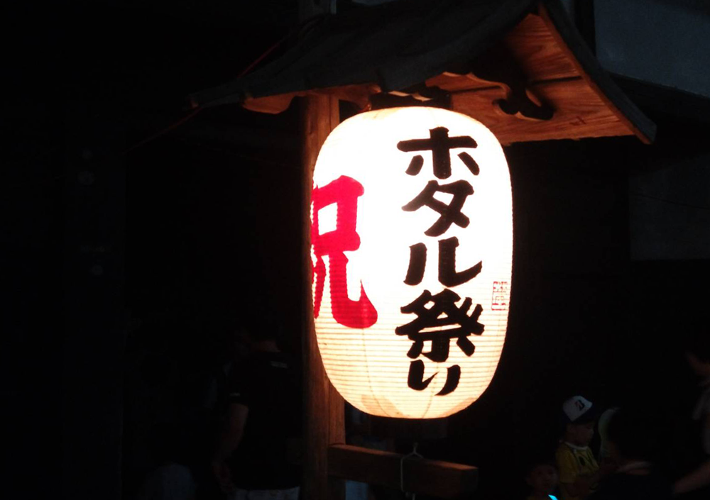
3) Festivals are “living calligraphy” for a day
On festival days, writing is both useful (it must be read) and symbolic (it bears meaning and prayer).
(1) Type meant to be read
- Bold stroke widths: Legible in crowds, at night, and while shaking.
- Designed ma (negative space): The balance inside and outside forms creates rhythm that the eye can track quickly.
- Edo-style display scripts (e.g., Edo-moji, kanteiryū): Friendly proportions, soft corners, wide “bellies”—letters that stay readable and welcoming under pressure.
(2) Materials and light shape the line
- Lantern paper (transmitted light): At night the line “floats” as light passes through paper.
- Cloth (happi, tenugui): Ink behaves like dye; designers emphasize crisp edges to offset bleed.
- Carved wood (floats, plaques): Relief shadows thicken lines and add presence—reading by light.
- Washi: Bleed and dry-brush create a sense of life in the stroke.
(3) Writing as participation
- Ema (votive plaques) & tanzaku strips: Fixing a wish in clear words is itself a ritual act of writing.
- Goshuin (shrine seals): A traveler’s and believer’s edited record—vermilion seals plus black calligraphy. (Etiquette: pray first, then request a seal during posted hours.)
4) A 5-minute field checklist (phone in hand)
- Stroke width × spacing: Can you read it from far away?
- Black × vermilion balance: Where does your eye settle?
- Day vs. night: How does light change the density of the line?
- Happi back characters: Same word, different styles—spot the neighborhood variations.
- Material differences: Paper, cloth, wood—how does each alter texture and edge?
5) Manners & cultural respect
- Worship first, then photos: For goshuin, confirm hours and queues; do not block pathways.
- Never obstruct movement: Give right of way to mikoshi and float teams—safety comes first.
- Meanings matter: If using Japanese words on clothing or tattoos, learn their meanings and context; avoid joking with sacred phrases.
Conclusion: A month when letters breathe in the streets
In September, function (to be read) and meaning (to carry prayer) merge in writing that truly lives. Think of the city as a single scroll: stroke width, spacing, material, and light all converge into a public lesson in calligraphic design. The next time you catch a festival, don’t just look at the parade—read the town.
deepens your connection to Japanese tradition.Explore and purchase hand-selected Japanese calligraphy artworks:
https://calligraphyartwork.stores.jp/


コメント