
Introduction: When Shodo Meets Washoku
Japanese cuisine is often described as a feast for the senses—but for many travelers and design-minded diners, the most unforgettable moment comes before the first bite: the quiet beauty of the plate itself.
In that stillness, you can feel an invisible connection to shodo japanese calligraphy—the Japanese art of brush and ink. Shodō is not only about “beautiful characters.” It is about rhythm, intention, and the expressive power of space. And modern washoku presentation often speaks the same visual language.
This article explores how calligraphy-inspired aesthetics—especially ma (the space between)—can help you “read” a dish like you would read a brushstroke. It’s a fresh lens on Japanese culture, and a surprising bridge between craft traditions and contemporary fine dining.
The Shared Grammar: Line, Balance, and “Ma”
“Ma” as Meaning, Not Emptiness
In calligraphy, the white paper is not a background. It is part of the message. The pause between strokes and the breathing room around a character allow the ink to feel alive.
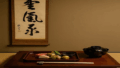
In Japanese plating, the same idea appears as purposeful negative space—an aesthetic often discussed as ma. Rather than covering the entire surface, many Japanese presentations leave notable blank space to create calm, clarity, and focus. This approach has been described as a key characteristic of Japanese plating, where the empty area is not “unused,” but actively shapes the viewer’s attention.
A Plate as Paper, A Sauce as Ink
Even outside Japan, you’ll see plating styles that resemble the logic of brushwork:
- a single dark line of sauce crossing a pale plate (like one decisive stroke)
- a misty, diluted wash of color suggesting sumi e (sumi-e) ink-wash painting
- asymmetry that feels natural rather than engineered
- contrast between matte and gloss, rough and smooth—like dry brush vs. wet ink
These echoes matter because they reveal something deeper about japan and culture: refinement through restraint, and emotion conveyed without shouting.
Moritsuke: The “Composition Rules” Behind Japanese Plating
Why Arrangement Is a Craft (Not Decoration)
In Japan, plating is often discussed through the lens of moritsuke—the craft of arranging food thoughtfully. Moritsuke is not merely about prettiness; it connects ingredients, seasonality, vessel choice, and the diner’s gaze.
A useful way to think about moritsuke is this:
ingredients are your vocabulary, the plate is your page, and arrangement is your grammar.
The Role of Seasonality and Tableware
A major part of washoku’s identity is seasonality—ingredients, colors, and even the feeling of time. That seasonal awareness is one reason washoku was recognized by UNESCO as an Intangible Cultural Heritage: it reflects social practices that value nature, local ingredients, and cultural continuity.
In practice, seasonality shows up visually:
- spring greens and tender blossoms
- summer glassware and cooling negative space
- autumn browns, reds, and warm ceramics
- winter textures, steam, and lacquered bowls
When you see these choices, you’re not only looking at food. You’re witnessing a living form of Japanese culture design.
From Tokonoma to Table: Calligraphy in the Tea-and-Kaiseki Tradition
Calligraphy as the “Theme” of Hospitality
To understand why calligraphy and food feel so naturally connected, it helps to look at tea culture. In traditional tea settings, the tokonoma alcove and its hanging scroll can set the mood and theme of the gathering. A single phrase—often calligraphy—becomes a quiet guide for how guests should enter the moment.
That sensibility extends into kaiseki traditions, especially cha-kaiseki, the meal served in connection with tea. In classic descriptions, cha-kaiseki includes structures such as soup and seasonal courses (for example, clear soup and a seasonal platter), building a flow that feels almost like a scroll being unrolled: light, then grounded; simple, then resonant.
“Reading” a Meal Like a Scroll
Kaiseki is not only a series of dishes. It is a sequence of attention:
- the first visual impression
- the pause before tasting
- the quiet shift from one bowl to the next
- the final calm of tea
Seen this way, the meal becomes a narrative. The calligraphy-inspired aspect is not a literal “copy,” but a shared cultural preference for rhythm, space, and meaning.
Modern Fine Dining: Why This Aesthetic Feels Global Now
Minimalism, Mindfulness, and Luxury
High-end dining worldwide has embraced minimalism—but Japanese plating offers a distinctive version of it. The “luxury” is not abundance on the plate; it is precision, silence, and controlled intensity.
For international audiences—especially curious readers with the time and resources to travel—this is compelling because it feels both exclusive and humane:
- it invites you to slow down
- it respects the ingredient
- it treats the diner as a thoughtful observer
This is also where the image of a Japanese artist becomes relevant: chefs and craftspeople operate like artists who work with time, temperature, and attention. The plate becomes an installation you can taste.
Try It Yourself: A Calligraphy-Inspired Plating Exercise
You don’t need a Michelin reservation to experience this connection. Here’s a simple exercise you can try at home—especially if you enjoy design, ceramics, or shodo.
Step 1: Choose One “Character”
Pick one main ingredient (a piece of grilled fish, tofu, a slice of fruit). Make it the “main character” on the plate.
Step 2: Decide the Direction of Flow
Calligraphy strokes have direction. Place the ingredient so the plate suggests movement—left-to-right, diagonal, or vertical.
Step 3: Use Negative Space Intentionally
Leave more empty space than you think you need. Then stop. The calm is the point.
Step 4: Add One “Ink Accent”
Add a small dark accent—black sesame, soy reduction, seaweed, or a deep-colored sauce. Think of it as ink, not decoration.
Step 5: Finish with a Seasonal Touch
A citrus peel, a herb leaf, a small edible flower—something that signals season and time.
This small ritual trains your eye to notice what washoku masters and calligraphers share: the courage to leave space.
Conclusion: Seeing with Cultural Eyes
Modern washoku presentation can be appreciated as culinary design—but when you view it through the lens of Japanese calligraphy, it becomes something richer: a cultural philosophy you can eat.
The next time you see a quiet plate with a single bold accent, notice the ma. Notice the rhythm. Notice how the dish seems to “breathe.”
That awareness deepens your sense of Japanese culture, and it may even change how you see your own everyday meals.
Experience authentic Japanese calligraphy:
https://calligraphyartwork.stores.jp/

コメント